User Interaction Analytics - Click Heatmap - Click Heatmap


The Click Heatmap report shows the click heatmap of the selected page.
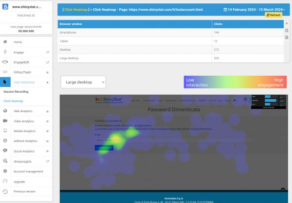
Heatmaps show which areas users interact with the most by overlaying a layer showing different colors on the page.
The red color indicates the areas where the most clicks are made and where users' attention is focused. Where there are few interactions, the areas are dark or blue.
By selecting a type of device, the representation shows the content by setting different page widths (smartphone, tablet, desktop, large desktop), each width is characteristic of the selected device.
Clicks are grouped by device as shown in the table.
With the control panel in the top right corner of the heatmap, you can set the size of the circles and the blur effect, particularly useful when the clicks on the page are a few scattered points to show the areas where the clicks are concentrated.
In the panel you can also set the transparency level of the layer overlaying the page to determine the visibility of the underlying page.